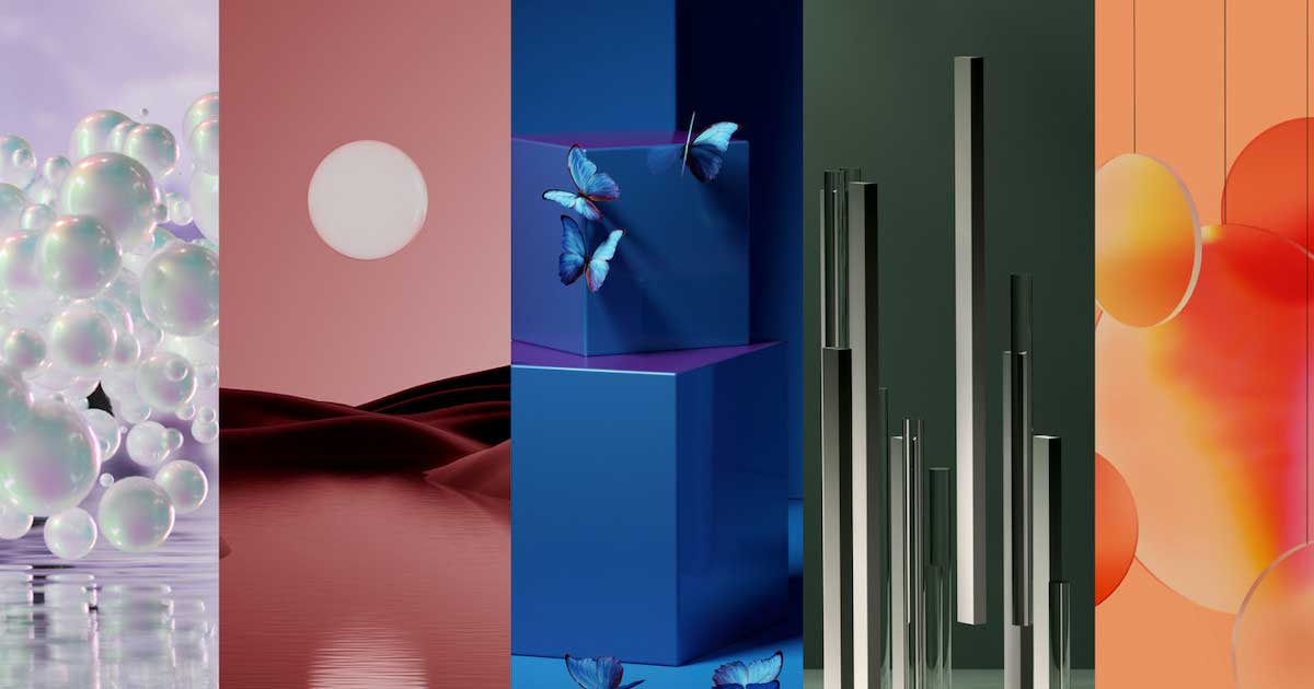
As a long-time color junkie, I recently spent some time looking into some colors for a new brand that I am building called EVENT MINDS matter. My exploration inspired this story, as it could not have aligned any better with my vision.
Color encapsulates the essence of motivational forces that drive us all.
For some, health and healing will be a priority, while for others discovery and travel will reignite the imagination.
The key colors moving into 2023/2024 are Digital Lavender, Astro Dust, Galactic Cobalt, Sage Leaf and Apricot Crush. Why? Because of the need for a therapeutic culture of healing, discovery, transformation and pleasure. These colors capture the evolving behaviors that are sensitive to the shifting emotional states and changing lifestyles that we have all experienced.
Confidence will return and vibrant, energizing colors will resonate, connecting to travel and discovery, reigniting the imagination. In contrast, healing and settling tones will appeal to people seeking to calm and rebalance their body and mind.
As new narratives emerge, the desire to live with intent increases, along with the right choices for yourself, the planet and other species. With a holistic overview into wellness, designing for emotion will be key, as people will need to feel supported while building their vision of the future.
We will explore new relationships and gender norms while being truly inclusive, reflecting the wonderful multiple facets of life. These colors stay closely connected to digital wellness and escapism. There will be a growing demand for health-boosting digital therapy and calm-tainment.
As the pursuit of mindfulness becomes embedded in our brains, wellness routines, immersive VR and micro-digital platforms will provide a gamified sensorial, self-care experience.
Digital Lavender
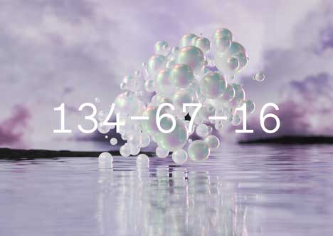
Digital Lavender has a soothing and balancing property that connects it directly to the growing mental health movement. It is seen as restful, gender-inclusive and signifies that stability, serenity and digital escapism are meeting the needs of a human race in recovery. This color is part of the recuperative rituals to both protect and improve our lives in the future.
Astro Dust
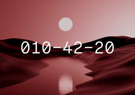
Astro Dust is a captivating mid-tone red that connects to space exploration. As commercialized space travel evolves and space tourism becomes a reality, colors of the universe will excite and inspire us. This deep mineral tone evokes the dusty and desolate landscape of Mars and captures the desire to explore remote terrains and planets. Astro Dust personifies a shift toward off-kilter colors that feel intriguing and forward-looking. This color is gender-inclusive and a great red update for all types of applications.
Galactic Cobalt
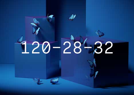
In the fall of 2023/2024, hyper-bright Galactic Cobalt will step up, influenced by next-generation color technologies, and it is expected that it will be the most dynamic and influential. This intense and digital hue takes inspiration from the new Space Age along with the evolution of the metaverse. Transformative, technologically driven experiences will push forward intense and dynamic blues, enabling us to connect to escapism and extended reality.
Sage Leaf
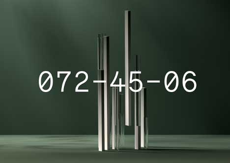
Slowed-down lifestyles have introduced us to new or forgotten concepts around rest. As our lifestyles adjust further, consumers will be sensitive to overstimulation and look to environments and colors that reduce anxiety and stress levels in the brain. Sage Leaf is a quiet and settling green that instills a sense of contemplation, rest and reflection. Sage Leaf will be an important color for reductive, considered design.
Apricot Crush
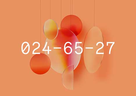
By the fall of 2023/2024 orange will step up, providing a fruity injection of energy to the season. Apricot Crush is an activating mid-tone with a restorative quality that aligns to balancing lifestyles and nourishing body and mind. This vitamin-balancing hue is a step up from soft, mindful pastels to brighter and more invigorating tones. This orange brings a warming luminosity and contributes to the soft, sun-bleached nature that everyone is indulging in.
If you’re a creative, designer, idea hunter or just curious, then keep these in the back of your mind, because I can guarantee that you will see these on the horizon soon. We still have to get through 2022, but this is part of the COVID legacy that will reshape our aesthetic preferences.
